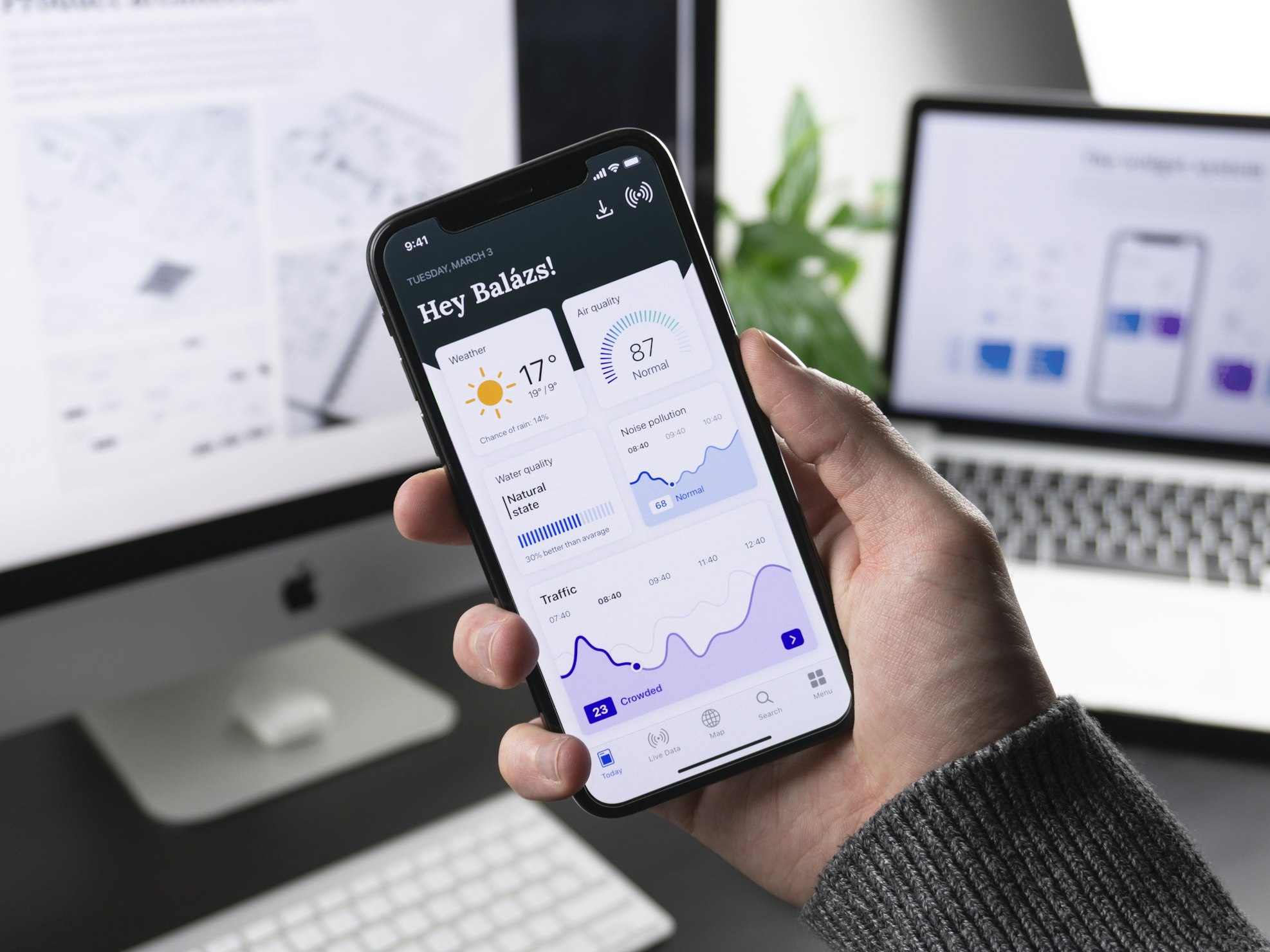
Effective App Store screenshots do two jobs: they show the real interface and explain why the product is useful. A polished frame or gradient cannot rescue a confusing sequence, so start with the story before opening the editor.
1. Define the first-screen promise
Choose the single benefit a new visitor should understand first. Write a short headline in plain language, pair it with the screen that proves the claim, and remove secondary details that compete for attention.
2. Plan a complete screenshot sequence
Arrange the remaining slides around the questions a potential user is likely to ask. A practical sequence might introduce the main benefit, demonstrate the core workflow, show a differentiating feature, and finish with a trust or convenience message.
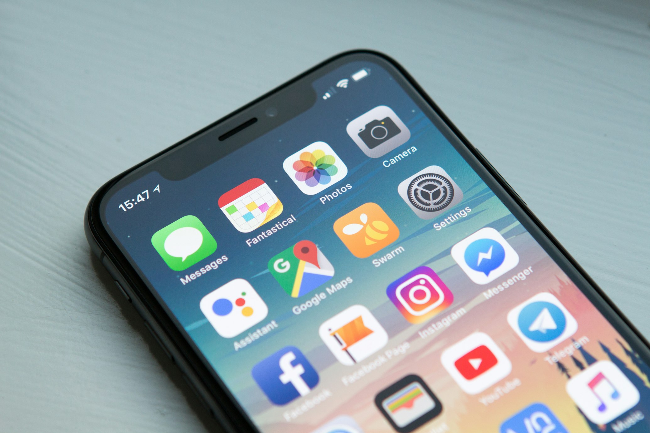
3. Keep copy readable at store size
Use one headline hierarchy across the set. Prefer short benefit-led phrases, strong contrast, and enough empty space around the copy. Preview the screenshots at a small size instead of judging typography only on a desktop canvas.
4. Use device frames intentionally
A device frame can provide context, but it should not shrink the interface until important details disappear. Use the same frame treatment and color across the sequence, and consider a frameless screen when the interface itself needs maximum space.
5. Validate the export
Apple accepts specific screenshot dimensions and does not allow alpha-channel transparency. Check the current App Store Connect screenshot specifications before submission.
- Confirm pixel dimensions and orientation.
- Inspect text, gradients, and device edges at full resolution.
- Remove transparency from the final export.
- Review the complete sequence on a phone-sized preview.
Create an iOS screenshot set, review the current size guide, or start from a ready-made template.